Buttons are used to trigger an action—for example, submitting a form, sending an agent email, resolving an interaction, or changing the topic.
Button Configurations
When adding buttons in a workflow, several configuration options are available. See below for the required and optional settings.
Button Group Settings:
ID |
Name |
Description |
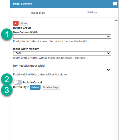
1 |
Button Group Size |
Several sizing options are available for button groups, allowing you to choose what best fits your design and layout needs. For more details on how size options work, see Workflow Elements Size Options here. |
2 |
Include Cancel (Default Styled Button Group Only) |
In a button group, a 'Cancel' button link can be provided to agents, allowing them to close the interaction they are working on (Note - any changes made to the interaction are not saved). |
3 |
Button Style |
There are two button styles available by default.
1. Default: This is the 'Default' button style used across the iService® UI.
2. Timeline Steps: The Timeline steps option arranges buttons in a streamlined view, typically used to display the stages an interaction goes through from start to finish.
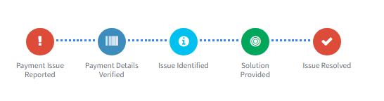
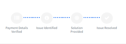
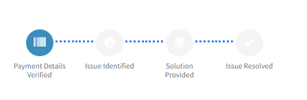
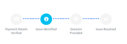
For example, consider a customer with a 'Payment' related issue.
Since buttons can trigger specific sections of the Answer Panel, each stage of the issue—from the Payment Issue being reported to the Solution Provided—must be addressed until the issue is resolved.
Each button action is tracked in iService®, providing management with insights into the status of the issue and the progress between each stage.
|
Button Settings(Individual)
Each button has individual settings, allowing it to perform its own configured actions.
Below are some of the customizations available:
ID |
Name |
Description |
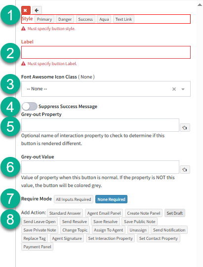
1 |
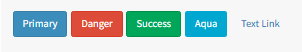
Style |
Select the button's 'Style' based on the action it performs. For example, a button that triggers a 'Resolve' action might use the 'Danger' style to highlight that the interaction will be closed when clicked.
Here is a quick view of the button styles available:
Quick Tip: Resolved Interactions can be "Reopened" at any time by using the "Understanding Interactions" option. See the "Questions" section under "Interaction Types and Status" for more details! |
2 |
Label |
This defines the name or label displayed on the button. |
3 |
Button Icon |
Select an icon from the available list that best represents the button’s purpose. |
4 |
Suppress Success Message |
Each button in the workflow has a default success message that pairs with its label. For example, a button labeled 'Resolve' will show a 'Resolve Success' message in the bottom-left of the iService® interface.
In some cases, this message should be bypassed. For instance, a button that opens the Agent Email panel shouldn't show a success message, as it only opens the panel—it doesn't send the actual email, which could lead to confusion. |
5 |
Grey-Out Property |
To change a button’s appearance, use the 'Grey-Out' property. Enter the property to be checked—if the condition is not met, the button will appear greyed out to indicate it's not the active step; if the condition is met, the button will be colored to show it's active. |
6 |
Grey-Out Value |
This is the value that will be checked against the property specified above.
For example, in the first stage of a payment issue, we've setup this test workflow to check the value of the 'Payment Issue Stage' property.
This property is updated when agents click the corresponding payment issue buttons below. Before any button is clicked, all flow steps appear greyed out. When a stage is selected, its button becomes colored to indicate it is the active step in the workflow.
|
7 |
Require Mode |
Require all inputs on the form to be filled out before the form can be submitted |
8 |
Add Action |
Add an action to the selected button from the list of available actions.
For details on button actions, refer to "Panel Actions" |