At its core, Tab Groups are used to split forms into sections or to display parts of a form conditionally—either when clicked or when certain workflow conditions are met.
Tab Configurations
When setting up a tab group, there are two types of configurations available:
Tab Group Settings
These are settings applied at the group level — they control the overall behavior and appearance of the entire tab group.
Example: Similar to how settings apply to a Button Group element.
ID |
Name |
Description |
1 |
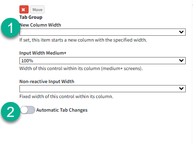
Tab Group Size |
Several sizing options are available for tab groups, allowing you to choose what best fits your design and layout needs. For more details on how size options work, see Workflow Elements Size Options here. |
2 |
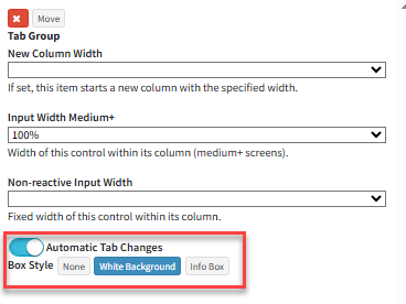
Automatic Tab Changes |
The Automatic Tab Changes toggle determines if tabs in the group will be navigated manually or automatically when a condition on the submit form or answer panel is met. More detail on Automatic Tab Changes can be found below. |
3 |
Box Style |
When the "Automatic Tab Changes" toggle is turned on, an additional setting is available for the user to select:
Box Style is the style in which the tab group will be displayed.
None – No box style or label is shown. Only the content of the selected tab is visible.
White Background –
Info Box – Displays both the tab content and the tab label when selected, giving it an informational card-like appearance. |
Tabs in a Tab group can be navigated in two ways by agents:
Manual Tab Changes (Toggle Off)
All tabs are shown, and the agent manually switches between tabs.
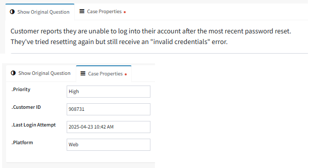
For Example: A custom workflow answer panel with two tabs—one showing the details of a ticket, and the other displaying information such as case properties tied to the interaction.
Automatic Tab Changes (Toggle On)
Tabs are displayed based on a specific condition—typically the value of an interaction property. When Automatic Tab Changes is enabled, the workflow builder prompts users to define a condition for each tab, specifying when it should be shown and what content it displays.
Example:
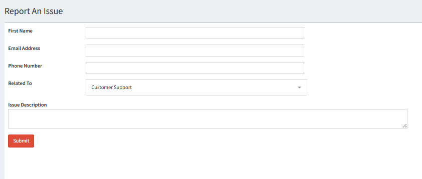
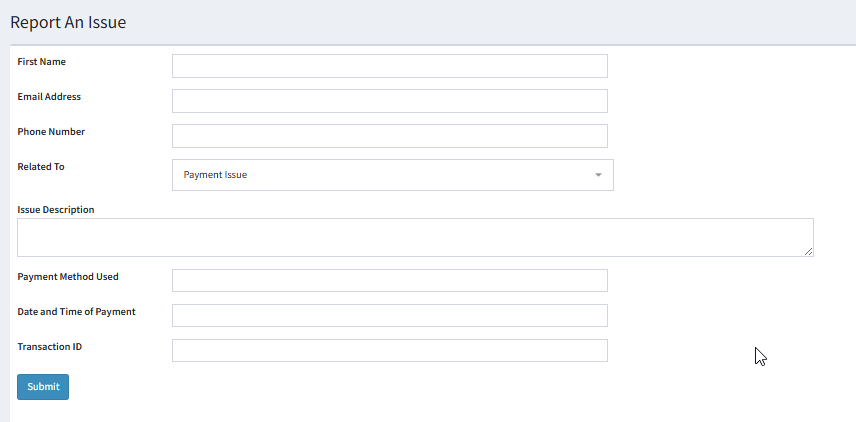
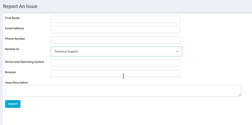
A Submit Form allows customers to report one of three issue types: Payment Issue, Customer Support, or Technical Support.
When a customer selects an issue type:
- A ticket is created for the corresponding team.
- The relevant tab is displayed on the form which would be hidden till the customer selects the issue they are reaching out for, showing questions specific to that issue type to gather more context from the customer.
See below:
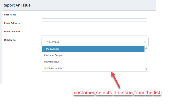
Selecting each issue from the list will display a different set of inputs for the customer to fill out:
1. Customer Support:
2. Payment Issue:
3. Technical Support:
Tab (Individual) Settings
After configuring the tab group settings, each individual tab must be set up with the following:
ID |
Name |
Description |
1 |
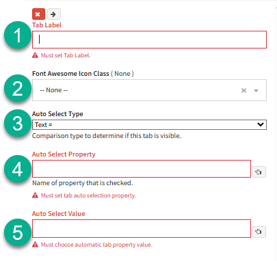
Tab Label |
The label of the tab. This will be visible in the workflow form / answer panel only when Automatic Tab Changes is turned off, or when using the Info Box style with Automatic Tab Changes enabled. |
2 |
Tab Icon |
The Icon of the tab. This will be visible in the workflow form / answer panel only when Automatic Tab Changes is turned off, or when using the Info Box style with Automatic Tab Changes enabled. |
3 |
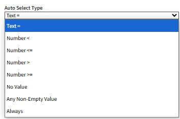
Auto Select Type (Automatic Tab Changes Only) |
Select the condition of the data that will be compared to display the tab selected.
- Text = Compares when the text value exactly matches the specified string.
- Number < Displays the tab when the value is less than the specified number.
- Number <= Displays the tab when the value is less than or equal to the specified number.
- Number > Displays the tab when the value is greater than the specified number.
- Number >= Displays the tab when the value is greater than or equal to the specified number.
- No Value Displays the tab when the interaction property has no value set.
- Any Non-Empty Value Displays the tab when the interaction property contains any value (i.e., is not blank or null).
- Always Only applicable to the last tab in the tab group. This displays the tab when the interaction property value does not match any of the conditions defined for the other tabs |
4 |
Auto Select Property (Automatic Tab Changes Only) |
The interaction property used to verify the specified 'Auto Select Value'. |
5 |
Auto Select Value (Automatic Tab Changes Only) |
Specify the interaction property value used to display the corresponding tab |